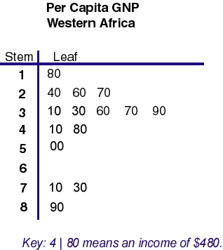
Stem and leaf plots use numbers to help visualize data. The stem part of the plot is considered to be the number to left of the line. The leaf part of the plot consists of the digits to the right of the line. The combination produces a whole number. For instance, the stem of 2 and the leaf of 60 combines together to make the per capita GNP data number of 260.
Wednesday, October 1, 2008

#49 Box Plot
 >Source: http://www.onlamp.com/php/2004/07/22/graphics/boxplot.jpg
Box plots appear complicated but once learned are easy to read. The box contains the middle set of data. The top of the box represents the 75th percentile and the lower part of the box represents the 25th percentile. The line in the box represents the median of the data. Data sets outside the box are outliers. The specific box plot is one of test takers with varying anxiety levels. The median score of test takers with low anxiety was about 48. Scores ranged from about 26 to 74 on the test, for this particular anxiety level.
#48 Histogram
 A histogram is a convenient way to display numerical results or the frequeinces uptained while doing a task. This particular histogram shows the frequinces of the number of times two dice add up to a particular number during trial peirod of 36 rolls.
#47 Parallel Coordinate Graph
A parallel coordinate graph is used to plot large numbers of datasets. Certain relations can be obtained through using such a graph.
 >Source: http://www.iwi.uni-hannover.de/lv/seminar_ss05/bartke/Assets/parall2.jpg
 >Source: http://www.iwi.uni-hannover.de/lv/seminar_ss05/bartke/Assets/parall2.jpg
 #46 Triangular Plot

A triangle plot is a graph of 3 variables. The proportions of the three variables within the triangle plot add up to a constant. This particular plot shows how the eligible voters of the UK tend to vote in an election. The white circle indicates the results of an pre-elction poll.
#45 Wind Rose
 >Soure: http://mensch.org/vplot/windrose2/windrose.png
A wind rose is helpful to meteorologists because it graphically shows both where the wind is coming from and its frequency of the speed. The length of the vectors on the wind rose graph show the percentage of time the wind blew from a particular direction. On this particular chart one can tell that the winds came in from a westerly direction.
#44 Climograph
Climographs graphically show the average precipitation and average temperature at a particular location over a 12 month period of time. This climograph was made using statistics from Memphis, TN. The warmest month tends to be June. Winter and spring months are usually wetter than summer and fall months.

#43 Population Profile
 >Source: http://www.coventry.gov.uk/ccm/cms-service/stream/image/?image_id=1660022
A population profile is simply a chart showing people as a function of their ages as they relate to a topic. This particular profile depicts the sex of the different age groups.
#42 Scatterplot
Scatter plots use both horizontal and vertical axes to plot data points. The purpose for using this particular plot is to show how much one variable is affected by another. The scatterplot below is from differnet weather reporting locations in Nevada. The higher up the reporting station is the more likely the mean annual temperature is lower.

>Source: http://argyll.epsb.ca/jreed/math9/strand4/scatterplot1.gif
#41 Index Value Plot
 >Source: http://water.usgs.gov/waterwatch/regplots/real/real_us_2.gif
This type of plot shows recorded values over a period of time on a graph. Usually are set against the norm or average for whatever is being graphed. This particular index value plot displays streamflows over the last several years of the United States and shows where the normal value is.
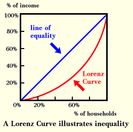
#40 Accumulative Line Graph or Lorenz Curve
 A Lorenz curve is a function of a sizable proportion of ordered individuals mapped onto the corresponding cumulative proportion of their size. A lorenz Curve is commonly used when graphing economical conditions. This lorenz curve graphs the cumulative proportion of percentage of income and the cumulative proportion percentage of households.
 >Source: http://ingrimayne.com/econ/AllocatingRationing/Figure6.5.gif
#39 Bilateral Graph
Bilateral graphs depict two different varibales on the same graph. Values can be either negative or postive. This graph involves humanitarian aid and shows countries' either growth or retraction in the amount of aid given in 2005 throug 2006.
 >Source: http://www.globalhumanitarianassistance.org/New%20Images/Growth%20in%20bilateral%20humanitarian%20assistance%202005-2006%20copy.jpg
#38 Nominal Area Choropleth Map
A nominal map displays a qualitative classification of different groups. This particular map depicts what states were suppose to the democratic canidate and which ones were suppose to go to the Republican canidate during the 2008 election.


#37 Unstandardized Choropleth Maps
 Unstandardized choropleth maps depict unordered categories on maps. There are no rankings or layerd data but important information is still displayed.
>Source: https://courseware.e-education.psu.edu/courses/geog482/graphics/citationexample.jpg
#36 Standardized Choropleth Maps
Data displayed on choropleth maps has been standardized or set to the same standard to allow readers to compare data from different locations from withon the map. The map below shows population per square of the United States on a state by state basis.


#35 Univariate Choropleth Maps
 A univariate choropleth map displays a single set of data via coloring or unique shading .
 This particular univarite choropleth map shows wer poverty exists in the United States.
>Source: http://www.cdc.gov/pcd/issues/2007/oct/images/07_0091_02.gif
>Source: http://www.cdc.gov/pcd/issues/2007/oct/images/07_0091_02.gif
#34 Bivariate Choropleth Maps

These types of complex maps display two or more different variables, all on the same map. Coloring or types of shading is used to show the multiple pieces of data on the map. Even though variables are different, they more than likely are related to the same topic. The map above deals with olympic atheletes and shows where both the winter and summer ones come from and to what exntent.
#33 Unclassed Choropleth Maps
Unclassed choropleth maps are colored in order to show data, but the values that are being colored are not dependent upon each other. This technique assigns shadings based on the fact that different values are only proportional to each other and on the same map. The map below shows the density of lightenting that occurs in the country per area.

#32 Classed Choropleth Maps
 A classed choropleth map displays data through the use of colors. These colors are of the same shade but vary in lightness and darkness. Only one variable is mapped out, but one can see how this variable changes from area to area. The example map shows the percentage of hispanics per county in Florida.
>Source: http://www.ilstu.edu/~jrcarter/Geo204/Choro/Tom/hispanic_race_fl-H1_FINAL.gif
#31 Range Graded Proportional Circle Map

>Source: http://mapmaker.rutgers.edu/355/dotProporCircle.jpg
Range graded proportional circle maps use evenly graded circles to show their data. There is a set number of sizes that can be used, unlike variable maps which exhibit size variation.
Range graded proportional circle maps use evenly graded circles to show their data. There is a set number of sizes that can be used, unlike variable maps which exhibit size variation.
#30 Continuously Variable Proportional Circle Map
 A continuously variable proportional circle map uses circles in order to show data. Size of the circles is important because the larger the size the larger the value of data. Circles are in some sort of proportion to the data bein displayed. This map is of West Germany and shows the major industries of each produing city.
>Source: http://www.lib.utexas.edu/maps/europe/west_germany_ind_1972.jpg
#29 DOQQ
 >Source: http://seamless.usgs.gov/website/seamless/products/1mdoqq.jpg
A Digital Orthoimagery Quarter Quadrangles (DOQQ) is a computer-generated image of an aerial photograph. Image displacements caused by camera tilt and relief of terrain are removed from the image. This particular image is of Washington, D.C.
#28 DEM
 >Source: http://edc.usgs.gov/images/dem.jpg
A digital elevation model (DEM) is a digital representation of the surface topography or terrain. Remote sensing techniques are used to compose these maps. A DEM map is often used in geographic information systems. This particular DEM map is of Sturgis, SD.
#27 DLG
A Digital Line Graph is simply an digital representation of cartographic information derived from USGS sources. In the DLG below, borders, lakes, and rivers are shown, other terrain features are not.
 > Source: http://www.versamap.com/UsgsDlg_CaNvAzUt.png
 > Source: http://www.versamap.com/UsgsDlg_CaNvAzUt.png
#26 DRG
 DRG stands for a digital raster graphic. It is simply a digital copy of a USGS topographical map. Th is map shows an river winding through some hilles. The minimum resolution on these types of maps is around 250 dots per inch.
#25 Isopleths
 An isopleth is a line connecting equals points on weather chart. Isopleths can be used to show equal values of pressure, temperature, and wind speed. Some isopleths have certain names.
>Source: http://dstreme.comet.ucar.edu/images/sfc_pres.gif
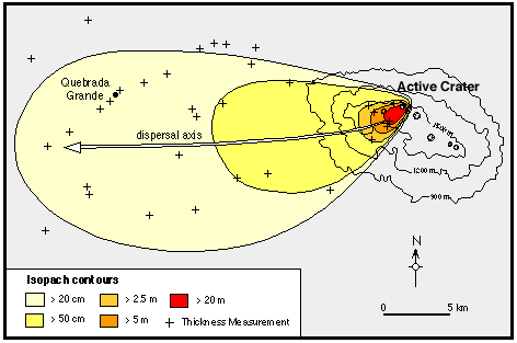
#24 Isopach

An isopach is a contour that connects points of equal thickness. One of the most common places to find this tpe of feature is on a map of where ash lands from a volcano. The map above exhibits that exact scenario.
>Source: http://www.geo.utexas.edu/faculty/barker/kempter/rbtephra.gif
>Source: http://www.geo.utexas.edu/faculty/barker/kempter/rbtephra.gif
#23 Isohyets

An isohyet is a line that is drawn on a map that connects points of equal precipitation. This map is of India where they receive lots of precipitation a year.
#22 Isotachs
 Isotachs are lines on a map connecting points with equal wind speeds. The most common map to find these lines are on upper air weather maps.
>Source: http://cimss.ssec.wisc.edu/oakfield/meso/500win1.gif
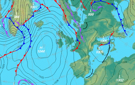
#21 Isobars
>Source: http://www.halesowenweather.co.uk/isobars.gi An isobar is a line drawn on a map connecting points of equal barometric pressure. The most common place to find these type of lines is on a weather map.
 An isobar is a line drawn on a map connecting points of equal barometric pressure. The most common place to find these type of lines is on a weather map.
#20 LIDAR
LIDAR is an optical remote sensing technique that bounces light off of an object, this in turn measures the distance from the ground up to the top of each object. We are then able to produce a computerized image of the vertical relief, with the use of colors.
 This is an LIDAR image of where the World Trade Towers once stood in New York City.
#19 Doppler Radar
Both of these maps represent images produced by doppler radar. Across the country there are hundreds of doppler radar sites. Doppler radar detects precipitation in the atmosphere.

>Source: http://radar.weather.gov/ridge/kmzgenerator.php
The map above is an kml file of doppler radar image out of the National Weather Service out of Tallahassee. In the image, one can clearly see precipitation over the Tallahassee region, but this is actually something known as ground clutter.  >Source: http://www.weatherusa.net/blog/images/doppler-orlando-1943.gif
This radar image from the Melbourne, FL doppler radar shows, quite clearly, Hurricane Frances transversing the State of Florida in 2004. Lighter precipitation values are shown in the green value while heavier precipitation values are depicted via the orange and red colors.
#18 Black and White Aerial Photo

>Source:http://historicaltextarchive.com/beaches/42stjohns2.JPG
A basic form of remote sensing is black and white aerial photography. This picture was taken by a satellite above an area between Jacksonville and the Atlantic Ocean. Whenever this picture was taken this particular area was sparsely populated. There is contrast between bodies of water and landmasses.
#17 Infrared Aerial Photo

This infrared aerial image is an aerial picture of Harrisburg, PA. This type of image can be used to see where vegetation exists. Both waterways and roads are clearly distinguishable. Because colors are not true in value a method was used called false color infrared imagery.
#16 Cartographic Animations
A cartographic animation is a map that has what appears to be motion but is simply nothing more than a sequence of the same map but with different data. When seen one after the other is appears what you are seeing is like a movie. This animation represents the impacts of storm surge produced by Hurricane Isabel.

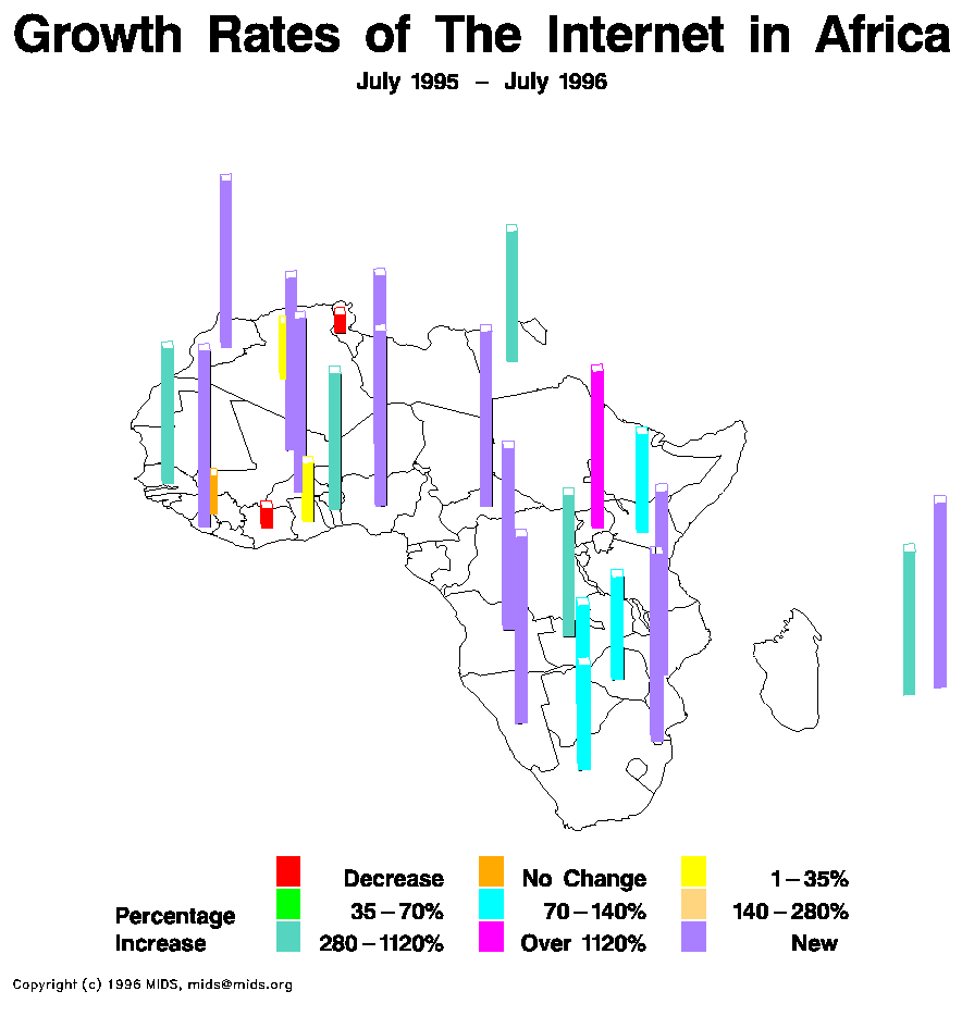
#15 Statistical Maps
 A statistical map gives a standard statistic over a period of time. This map shows a year of growth of the interneet on the contiet of Africa.
 >Source: http://personalpages.manchester.ac.uk/staff/m.dodge/cybergeography/atlas/mids_af_i_gr_c_large.gif
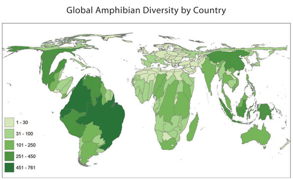
#14 Cartograms
A cartogram is a type of map where both sizes and shapes of boundaries have been distorted in some way in order to display the size data. This cartogram is of the amphibians in each country in the world. Countries in South Americ boast large variites of amphibians.

>Source: http://www.amphibiaweb.org/amphibian/cartograms/cart_global_diversity.jpg

>Source: http://www.amphibiaweb.org/amphibian/cartograms/cart_global_diversity.jpg
Thursday, September 25, 2008
#13 Flow Maps

These types of maps show the spreading out of objects or ideas from one location to many. In this particular map, Europe serves as the origination point for this particular object or idea and spreads out to multiple locations around the world.
#12 Isoline Maps
Maps that use lines to connect areas of data of equal values are known as isoline maps. Isolines are those lines that connect the equals values. Lines can make it easy for readers to see like values; where precipiation falls in equal amunts is easy to pickup on, on the map of Mexico.

>Source: http://www.lib.utexas.edu/maps/atlas_mexico/mean_annual_precipitaion.jpg

>Source: http://www.lib.utexas.edu/maps/atlas_mexico/mean_annual_precipitaion.jpg
#11 Proportional Circle Maps
 Proportional circle maps display data via circle representation. The larger the circle indicates the larger the data in value is. This proportional circle map shows the American Indian Population in several states in he U.S. Oklahoma and Arizona have the largest populations of Indians.
#10 Choropleth Maps
Choropleth Maps are thematic maps in which areas are shaded in accordance to the variables being displayed. Some sort of boundaries or political borders a re depcited and used on the map. The map of this type below shows where hay is produced in the United States, by county. The counties that are in the darkest shades of green produce the most hay.

#9 Dot Distribution Maps
Dot distribution maps use some sort of symbol to represent where data exists geographically. This dot distribution map indicates where military families live in Ohio; each green dot indicates a different military family.


#8 Propaganda maps
Propaganda maps are as simple as the name reads. These type of maps are made purposefully to spread misinformation to the public through inaccurate depictions. They are made to persuade people in heir train of thought. Propagaanda maps were commonly used to spread misinformation during World War I and World War II. The followong map was produced by Germany and shows the results of what would have happened if Germany had gotten its way during World ar I.

>Source: http://strangemaps.files.wordpress.com/2006/09/sur-le-vif-germany-wins-001.jpg
#7 Hypsometric maps
 Hypsometric maps use color or types shading to help show a demention of data. This particular map depcits through the use of color, elevations of Tajikistan.
#6 PLSS maps

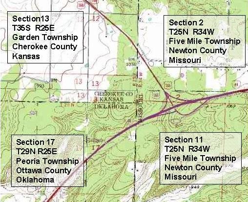
#5 Cadastral maps
 A cadastral map shows the boundaries and ownership of land parcels. Additional information details can be displayed on the map that helps distinguish ownership. Section and/or lots numbers are commonly displayed on these types of maps.
#4 Thematic maps
Thematic maps are ones that display a spatial distribution of an attribute of a single element. Usually, a thematic map displays a single attribute such as soil type, vegetation, geology, land use, or landownership. This particular one focuses on soil of the United States.


#3 Topographic Map
 These type of maps are two demensional and show the amount of change vertical in elevation. This specific map uses lines but can be depicted in colors as well.
>Source:http://content.answers.com/main/content/wp/en/thumb/6/6a/350px-Topographic_map_example.png
#2 Planimetric Map
A Planimetric map displays the horizontal position of features utilizing both lines and symbols. Vertical positions are not shown. Roads, buildings, and bodies of water are usually depicted on such map as like in this Chinesse map.
 >Source: http://www.loc.gov/rr/geogmap/guide/gm058002.jpg
Subscribe to:
Comments (Atom)
