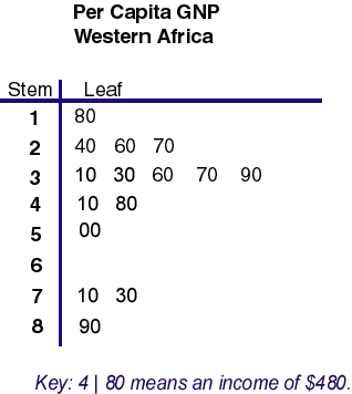
Stem and leaf plots use numbers to help visualize data. The stem part of the plot is considered to be the number to left of the line. The leaf part of the plot consists of the digits to the right of the line. The combination produces a whole number. For instance, the stem of 2 and the leaf of 60 combines together to make the per capita GNP data number of 260.
Wednesday, October 1, 2008


#49 Box Plot
 >Source: http://www.onlamp.com/php/2004/07/22/graphics/boxplot.jpg
Box plots appear complicated but once learned are easy to read. The box contains the middle set of data. The top of the box represents the 75th percentile and the lower part of the box represents the 25th percentile. The line in the box represents the median of the data. Data sets outside the box are outliers. The specific box plot is one of test takers with varying anxiety levels. The median score of test takers with low anxiety was about 48. Scores ranged from about 26 to 74 on the test, for this particular anxiety level.
#48 Histogram
 A histogram is a convenient way to display numerical results or the frequeinces uptained while doing a task. This particular histogram shows the frequinces of the number of times two dice add up to a particular number during trial peirod of 36 rolls.
#47 Parallel Coordinate Graph
A parallel coordinate graph is used to plot large numbers of datasets. Certain relations can be obtained through using such a graph.
 >Source: http://www.iwi.uni-hannover.de/lv/seminar_ss05/bartke/Assets/parall2.jpg
 >Source: http://www.iwi.uni-hannover.de/lv/seminar_ss05/bartke/Assets/parall2.jpg
 #46 Triangular Plot

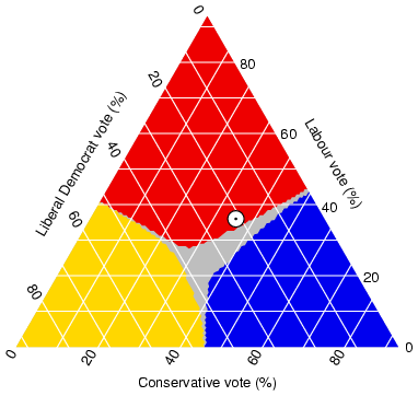
A triangle plot is a graph of 3 variables. The proportions of the three variables within the triangle plot add up to a constant. This particular plot shows how the eligible voters of the UK tend to vote in an election. The white circle indicates the results of an pre-elction poll.
#45 Wind Rose
 >Soure: http://mensch.org/vplot/windrose2/windrose.png
A wind rose is helpful to meteorologists because it graphically shows both where the wind is coming from and its frequency of the speed. The length of the vectors on the wind rose graph show the percentage of time the wind blew from a particular direction. On this particular chart one can tell that the winds came in from a westerly direction.
#44 Climograph
Climographs graphically show the average precipitation and average temperature at a particular location over a 12 month period of time. This climograph was made using statistics from Memphis, TN. The warmest month tends to be June. Winter and spring months are usually wetter than summer and fall months.

#43 Population Profile
 >Source: http://www.coventry.gov.uk/ccm/cms-service/stream/image/?image_id=1660022
A population profile is simply a chart showing people as a function of their ages as they relate to a topic. This particular profile depicts the sex of the different age groups.
#42 Scatterplot
Scatter plots use both horizontal and vertical axes to plot data points. The purpose for using this particular plot is to show how much one variable is affected by another. The scatterplot below is from differnet weather reporting locations in Nevada. The higher up the reporting station is the more likely the mean annual temperature is lower.

>Source: http://argyll.epsb.ca/jreed/math9/strand4/scatterplot1.gif
#41 Index Value Plot
 >Source: http://water.usgs.gov/waterwatch/regplots/real/real_us_2.gif
This type of plot shows recorded values over a period of time on a graph. Usually are set against the norm or average for whatever is being graphed. This particular index value plot displays streamflows over the last several years of the United States and shows where the normal value is.
#40 Accumulative Line Graph or Lorenz Curve
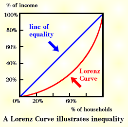
 A Lorenz curve is a function of a sizable proportion of ordered individuals mapped onto the corresponding cumulative proportion of their size. A lorenz Curve is commonly used when graphing economical conditions. This lorenz curve graphs the cumulative proportion of percentage of income and the cumulative proportion percentage of households.
 >Source: http://ingrimayne.com/econ/AllocatingRationing/Figure6.5.gif
#39 Bilateral Graph
Bilateral graphs depict two different varibales on the same graph. Values can be either negative or postive. This graph involves humanitarian aid and shows countries' either growth or retraction in the amount of aid given in 2005 throug 2006.
 >Source: http://www.globalhumanitarianassistance.org/New%20Images/Growth%20in%20bilateral%20humanitarian%20assistance%202005-2006%20copy.jpg
#38 Nominal Area Choropleth Map
A nominal map displays a qualitative classification of different groups. This particular map depicts what states were suppose to the democratic canidate and which ones were suppose to go to the Republican canidate during the 2008 election.


#37 Unstandardized Choropleth Maps
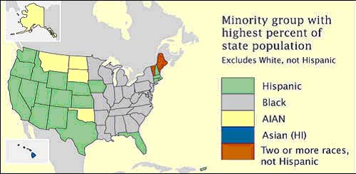
 Unstandardized choropleth maps depict unordered categories on maps. There are no rankings or layerd data but important information is still displayed.
>Source: https://courseware.e-education.psu.edu/courses/geog482/graphics/citationexample.jpg
#36 Standardized Choropleth Maps
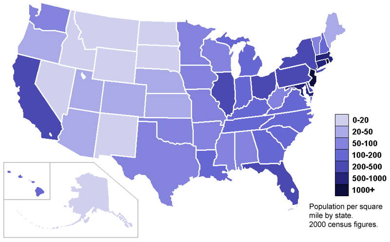
Data displayed on choropleth maps has been standardized or set to the same standard to allow readers to compare data from different locations from withon the map. The map below shows population per square of the United States on a state by state basis.


#35 Univariate Choropleth Maps
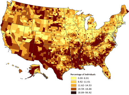
 A univariate choropleth map displays a single set of data via coloring or unique shading .
 This particular univarite choropleth map shows wer poverty exists in the United States.
>Source: http://www.cdc.gov/pcd/issues/2007/oct/images/07_0091_02.gif
>Source: http://www.cdc.gov/pcd/issues/2007/oct/images/07_0091_02.gif
#34 Bivariate Choropleth Maps

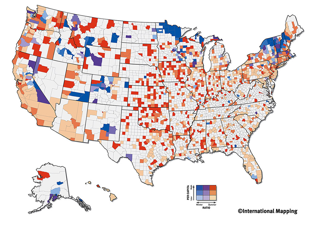
These types of complex maps display two or more different variables, all on the same map. Coloring or types of shading is used to show the multiple pieces of data on the map. Even though variables are different, they more than likely are related to the same topic. The map above deals with olympic atheletes and shows where both the winter and summer ones come from and to what exntent.
#33 Unclassed Choropleth Maps
Unclassed choropleth maps are colored in order to show data, but the values that are being colored are not dependent upon each other. This technique assigns shadings based on the fact that different values are only proportional to each other and on the same map. The map below shows the density of lightenting that occurs in the country per area.

#32 Classed Choropleth Maps
 A classed choropleth map displays data through the use of colors. These colors are of the same shade but vary in lightness and darkness. Only one variable is mapped out, but one can see how this variable changes from area to area. The example map shows the percentage of hispanics per county in Florida.
>Source: http://www.ilstu.edu/~jrcarter/Geo204/Choro/Tom/hispanic_race_fl-H1_FINAL.gif
#31 Range Graded Proportional Circle Map

>Source: http://mapmaker.rutgers.edu/355/dotProporCircle.jpg
Range graded proportional circle maps use evenly graded circles to show their data. There is a set number of sizes that can be used, unlike variable maps which exhibit size variation.
Range graded proportional circle maps use evenly graded circles to show their data. There is a set number of sizes that can be used, unlike variable maps which exhibit size variation.
Subscribe to:
Posts (Atom)