Wednesday, October 1, 2008

#41 Index Value Plot

>Source: http://water.usgs.gov/waterwatch/regplots/real/real_us_2.gif
This type of plot shows recorded values over a period of time on a graph. Usually are set against the norm or average for whatever is being graphed. This particular index value plot displays streamflows over the last several years of the United States and shows where the normal value is.


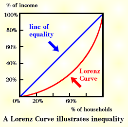
#40 Accumulative Line Graph or Lorenz Curve

A Lorenz curve is a function of a sizable proportion of ordered individuals mapped onto the corresponding cumulative proportion of their size. A lorenz Curve is commonly used when graphing economical conditions. This lorenz curve graphs the cumulative proportion of percentage of income and the cumulative proportion percentage of households.
>Source:
http://ingrimayne.com/econ/AllocatingRationing/Figure6.5.gif

#39 Bilateral Graph

Bilateral graphs depict two different varibales on the same graph. Values can be either negative or postive. This graph involves humanitarian aid and shows countries' either growth or retraction in the amount of aid given in 2005 throug 2006.
>Source: http://www.globalhumanitarianassistance.org/New%20Images/Growth%20in%20bilateral%20humanitarian%20assistance%202005-2006%20copy.jpg


#38 Nominal Area Choropleth Map

A nominal map displays a qualitative classification of different groups. This particular map depicts what states were suppose to the democratic canidate and which ones were suppose to go to the Republican canidate during the 2008 election.


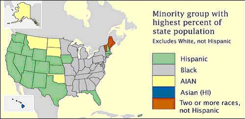
#37 Unstandardized Choropleth Maps

Unstandardized choropleth maps depict unordered categories on maps. There are no rankings or layerd data but important information is still displayed.

>Source: https://courseware.e-education.psu.edu/courses/geog482/graphics/citationexample.jpg

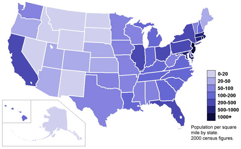
#36 Standardized Choropleth Maps

Data displayed on choropleth maps has been standardized or set to the same standard to allow readers to compare data from different locations from withon the map. The map below shows population per square of the United States on a state by state basis.


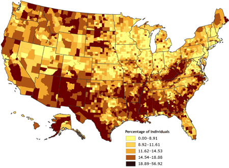
#35 Univariate Choropleth Maps

A univariate choropleth map displays a single set of data via coloring or unique shading .
This particular univarite choropleth map shows wer poverty exists in the United States.
>Source
:
http://www.cdc.gov/pcd/issues/2007/oct/images/07_0091_02.gif